After the impressive response of my "
5 awesome Login form design created using CSS and HTML" i have decided to write the sequel of this post and i hope you also like this collection. here in this post i have provided collection of 10 login form designs with ready made css and html. This login form are professionally designed with rich looks.Page loading faster although it has rich look so loading time is smaller which creates impression on your sites visitors. This designs are elegant and smooth. there is no little more no little less what i want to say is this login forms are designed perfectly.
Life's Good Login Form.
This design is very decent. it is jolly good design with well color combinations. there is perfect gentle design for professional web sites.Here is the screen shot how it looks like.
Code in HTML and CSS:-
<html>
<head>
    <style type="text/css">
        article,aside,details,figcaption,figure,
        footer,header,hgroup,nav,section {
            display: block;
        }

        html {
            font-size: 100%;
            -webkit-text-size-adjust: 100%;
            -ms-text-size-adjust: 100%;
        }

        input:focus,
        textarea:focus {
            outline: none;
        }

        label,
        select,
        button,
        input[type="submit"],
        input[type="radio"],
        input[type="checkbox"] input[type="button"] {
            cursor: pointer;
        }

        a,
        a:visited,
        a:active {
            text-decoration: none;
        }

            a:hover {
                text-decoration: none;
            }

        ::selection {
            background: #ed327b;
            color: #fff;
        }

        ::-moz-selection {
            background: #ed327b;
            color: #fff;
        }

        * {
            font-size: 100%;
            margin: 0;
            padding: 0;
            -webkit-box-sizing: border-box;
            -moz-box-sizing: border-box;
            box-sizing: border-box;
        }

        body {
            background: #63b47a;
        }

        * {
            font-family: "Helvetica Neue", Helvetica, Arial;
        }

        h5 {
            text-align: center;
            margin-top: 5px;
            color: rgba(0,0,0,.3);
        }

            h5 > a, a:visited {
                color: #fff;
                text-decoration: underline;
            }

                h5 > a:hover {
                    text-decoration: none;
                }

        form {
            background: #fff;
            border-radius: 6px;
            padding: 20px;
            padding-top: 30px;
            width: 300px;
            margin: 50px auto;
            box-shadow: 15px 15px 0px rgba(0,0,0,.1);
        }

        h1 {
            text-align: center;
            font-size: 1.4em;
            font-weight: 700;
            color: #ccc;
            margin-bottom: 24px;
        }

        span {
            font-weight: 200;
        }

        input {
            width: 100%;
            background: #f5f5f5;
            border: 0;
            padding: 20px;
            border-radius: 6px;
            margin-bottom: 10px;
            border: 1px solid #eee;
        }

        .btn {
            position: relative;
            width: 100%;
            padding: 20px;
            border-radius: 6px;
            border: 0;
            background: #f26964;
            font-size: 1.2em;
            color: #fff;
            text-shadow: 1px 1px 0px rgba(0,0,0,.1);
            box-shadow: 0px 3px 0px #c1524e;
        }

            .btn:active {
                top: 3px;
                box-shadow: none;
            }

        h6 {
            text-align: center;
            padding: 20px;
            padding-top: 35px;
            color: #777;
            cursor: pointer;
        }

        .social {
            display: none;
        }

        .fb {
            margin-top: 15px;
            background: #3b5998;
            box-shadow: 0px 3px 0px #2c416e;
        }

        .tw {
            background: #00acee;
            box-shadow: 0px 3px 0px #008dc3;
        }

        .google {
            background: #db4a39;
            box-shadow: 0px 3px 0px #b93f31;
        }
    </style>
    <script type="text/javascript">
        $(document).ready(function (e) {
            $('h6').on('click', function () {
                $('.social').stop().slideToggle();
            });
        })
    </script>

</head>
<body>
    <form>
        <h1><span>Life's</span> Good</h1>
        <input placeholder="Username" type="text" />
        <input placeholder="Password" type="password" />
        <button class="btn">Log in</button>
        <h6>Oh, social?</h6>
        <div class="social">
            <button class="tw btn">Twitter</button>
            <button class="fb btn">Facebook</button>
            <button class="google fb btn">Google+</button>
        </div>
    </form>

    <footer>
        <h5>Right click and visit: <a target="_blank" href="http://sharpaspdeveloper.blogspot.in">Life's Good</a></h5>
    </footer>
</body>
</html>
Ubuntu Login Form Design
This design may attract you with it's different looks from other ordinary design it is also very simple and good designs with animations. when you focus on inputs, those fields are highlighted and give you attention the where you are typing.this form is made up from red shaded background with single button in gray color.
Here is the look of this form.
Code in HTML and CSS
<<html>
<head>
<style type="text/css">
* {
margin: 0;
padding: 0;
font-family: 'Ubuntu', Arial;
}
body {
background: url("http://goo.gl/w6RY6");
}
.wrapper {
text-align: center;
width: 500px;
margin: 50px auto;
}
h1 {
color: #fff;
text-shadow: 1px 1px 0px rgba(0, 0, 0, 0.3);
margin-bottom: 20px;
}
section {
background: rgba(0, 0, 0, 0.4);
margin: 0 auto;
width: 300px;
padding: 20px;
text-align: center;
-webkit-border-radius: 10px;
-moz-border-radius: 10px;
border-radius: 10px;
-webkit-box-shadow: 0px 1px 0px rgba(225, 225, 225, 0.18);
-moz-box-shadow: 0px 1px 0px rgba(225, 225, 225, 0.18);
box-shadow: 0px 1px 0px rgba(225, 225, 225, 0.18);
}
.main-form {
display: block;
width: 280px;
margin-bottom: 15px;
padding: 10px;
outline: none;
-webkit-border-radius: 4px;
-moz-border-radius: 4px;
border-radius: 4px;
border: none;
background: rgba(225, 225, 225, 0.1);
font: 0.7em 'Ubuntu';
color: #fff;
transition: all .3s ease-in-out;
-moz-transition: all .3s ease-in-out;
-webkit-transition: all .3s ease-in-out;
}
.main-form:focus {
background: #fff;
transition: all .3s ease-in-out;
-moz-transition: all .3s ease-in-out;
-webkit-transition: all .3s ease-in-out;
color: #777;
}
button {
border: none;
background: #606c88;
background: -moz-linear-gradient(top, #606c88 0%, #3f4c6b 100%);
background: -webkit-gradient(linear, left top, left bottom, color-stop(0%,#606c88), color-stop(100%,#3f4c6b));
background: -webkit-linear-gradient(top, #606c88 0%,#3f4c6b 100%);
background: -o-linear-gradient(top, #606c88 0%,#3f4c6b 100%);
background: -ms-linear-gradient(top, #606c88 0%,#3f4c6b 100%);
background: linear-gradient(to bottom, #606c88 0%,#3f4c6b 100%);
padding: 17px;
box-shadow: 0px 1px 0px rgba(225, 225, 225, 0.2), 0px 1px 0px rgba(0, 0, 0, 0.4) inset;
outline: none;
width: 100%;
text-transform: uppercase;
color: white;
letter-spacing: 2px;
text-shadow: 1px 1px 0px rgba(0, 0, 0, 0.6);
cursor: pointer;
-webkit-border-radius: 4px;
-moz-border-radius: 4px;
border-radius: 4px;
margin-top: 5px;
font-family: 'Ubuntu';
}
button:active {
box-shadow: inset 0px 2px 1px rgba(0, 0, 0, 0.3);
}
footer {
padding-top: 20px;
text-align: right;
width: 330px;
margin: 0 auto;
}
.yolo {
-webkit-appearance: none;
background: rgba(0, 0, 0, 0.4);
padding: 9px;
border-radius: 3px;
display: inline-block;
position: relative;
transition: all .3s ease-in-out;
-moz-transition: all .3s ease-in-out;
-webkit-transition: all .3s ease-in-out;
}
.yolo:checked {
background-color: #fff;
color: #fff;
transition: all .3s ease-in-out;
-moz-transition: all .3s ease-in-out;
-webkit-transition: all .3s ease-in-out;
}
.yolo:checked:after {
content: '\2714';
font-size: 14px;
position: absolute;
top: 0px;
left: 3px;
color: #000;
}
h6 {
display: inline-block;
position: relative;
bottom: 4px;
left: 6px;
color: #fff;
font-weight: 300;
text-shadow: 1px 1px 0px rgba(0, 0, 0,0.6);
}
</style>
</head>
<body>
<div class="wrapper">
<h1>Ubuntu Login</h1>
<section>
<input class="main-form" type="text" name="usrname" placeholder="yolo@life.com" />
<input class="main-form" type="password" name="password" placeholder="password" />
<button>Sign in</button>
</section>
<footer>
<input class="yolo" name="" value="" type="checkbox" /><h6>Remember me</h6>
</footer>
</div>
</body>
</html>
Blue Free login Form design
This design is latest and which is also famous now a days, this login form has one button and 2 input fields which shows its simplicity .In right side of password input there is one small icon for help and bellow this form there is signup link. in this form there is a symbol of paper plane like freelancer which show freedom of ideas.

<html>
<head>
    <title></title>
    <style type="text/css">
        @import url(http://weloveiconfonts.com/api/?family=entypo);
        /* entypo */
        [class*="entypo-"]:before {
            font-family: 'entypo', sans-serif;
        }

        body,
        html {
            width: 100%;
            height: 100%;
            padding: 0;
            margin: 0;
            font-size: 1em;
        }

        body {
            /*linear-gradient*/
            background: -webkit-gradient(linear,left top,left bottom,from(#589ed9),to(#4984d0));
            background: -webkit-linear-gradient(#589ed9,#4984d0);
            background: -moz-linear-gradient(#589ed9,#4984d0);
            background: -o-linear-gradient(#589ed9,#4984d0);
            background: linear-gradient(#589ed9,#4984d0);
        }
        /* Style starts here */
        * {
            box-sizing: border-box;
            -webkit-font-smoothing: antialiased;
            font-family: "Helvetica Neue",hevetica,sans-serif;
            font-weight: 300;
            text-shadow: 0 1px 1px rgba(0,0,0,.4),0 2px 2px rgba(0,0,0,.24);
        }

        #form {
            width: 220px;
            margin: 25vh auto;
            text-align: center;
            color: #FFF;
        }

            #form header #logo {
                font-size: 3.4em;
                padding: 0;
                margin: 0 auto;
            }

            #form header h1 {
                font-size: 2.2em;
                padding: 0;
                margin: .2em 0;
            }

            #form article input {
                appearance: none;
                border: 0;
                padding: .8em .8em 1em;
                display: block;
                width: 100%;
                margin: 0em 0;
                border: 1px solid #fff;
                font-size: .8em;
                line-height: 1;
                color: #2c3e50;
                text-shadow: 0 0 0;
                outline: 0;
            }

                #form article input:nth-child(1) {
                    border-top-left-radius: 6px;
                    border-top-right-radius: 6px;
                    border-bottom: 0;
                    margin-bottom: 1em;
                }

                #form article input:nth-child(2) {
                    border-bottom-left-radius: 6px;
                    border-bottom-right-radius: 6px;
                    margin: -1em 0 0em;
                    border-top-color: #ccc;
                    /*box-shadow*/
                    -webkit-box-shadow: 0 2px 0 rgba(255,255,255,.4);
                    -moz-box-shadow: 0 2px 0 rgba(255,255,255,.4);
                    box-shadow: 0 2px 0 rgba(255,255,255,.4);
                }

        #tooltip--why {
            color: transparent;
            text-shadow: 0 0 0 !important;
        }

            #tooltip--why:after {
                content: '?';
                display: block;
                font-size: .65em;
                font-weight: bold;
                text-align: center;
                width: 1em;
                height: 1em;
                padding: .25em;
                /*border-radius*/
                -webkit-border-radius: 100%;
                -moz-border-radius: 100%;
                border-radius: 100%;
                position: absolute;
                margin: -2.8em 195px;
                z-index: 2;
                background: #b4b4b4;
                color: #fff;
                text-shadow: 0 0 0;
                line-height: 1;
            }

        #form article input[type=submit] {
            /*border-radius*/
            -webkit-border-radius: 6px;
            -moz-border-radius: 6px;
            border-radius: 6px;
            height: 45px;
            font-weight: bold;
            font-size: 1.2em;
            line-height: 0;
            /*linear-gradient*/
            background: -webkit-gradient(linear,left top,left bottom,from(#2186d4),to(#175dbd));
            background: -webkit-linear-gradient(#2186d4,#175dbd);
            background: -moz-linear-gradient(#2186d4,#175dbd);
            background: -o-linear-gradient(#2186d4,#175dbd);
            background: linear-gradient(#2186d4,#175dbd);
            color: #fff;
            border: 1px solid #34495e;
            text-shadow: 0 -1px 4px rgba(0,0,0,.4);
            /*box-shadow*/
            -webkit-box-shadow: 0 1px 4px rgba(0,0,0,.4), inset 0 1px 0 rgba(255,255,255,.4), inset 0 -1px 1px rgba(255,255,255,.1);
            -moz-box-shadow: 0 1px 4px rgba(0,0,0,.4), inset 0 1px 0 rgba(255,255,255,.4), inset 0 -1px 1px rgba(255,255,255,.1);
            box-shadow: 0 1px 4px rgba(0,0,0,.4), inset 0 1px 0 rgba(255,255,255,.4), inset 0 -1px 1px rgba(255,255,255,.1);
        }

        #form footer p a {
            font-weight: 600;
            text-decoration: none;
            color: #fff;
        }

        #contain_fields {
            /*box-shadow*/
            -webkit-box-shadow: 0 0 0px 1px #34495e;
            -moz-box-shadow: 0 0 0px 1px #34495e;
            box-shadow: 0 0 0px 1px #34495e;
            margin: 1em 0;
            width: 100%;
            height: auto;
            float: left;
            /*border-radius*/
            -webkit-border-radius: 6px;
            -moz-border-radius: 6px;
            border-radius: 6px;
        }
    </style>
   <script type="text/javascript">
    </script>
</head>
<body>
  <div id="form">
   <section>
    <header>
      <span id="logo" class="entypo-paper-plane"></span>
    <h1>Welcome.</h1>
          </header>
    <article>
     <div id="contain_fields">
       <input type="text" value="" placeholder="Enter Email address" />
      <input type="password" placeholder="Password" />
       <a href="#" id="tooltip--why"></a>
      </div>
      <input type="submit" value="Log in" />
      </article>
    <footer>
      <p><a href="#">Sign up</a> for a new account</p>
    </footer>
  </section>
 </div>
</body>
</html>
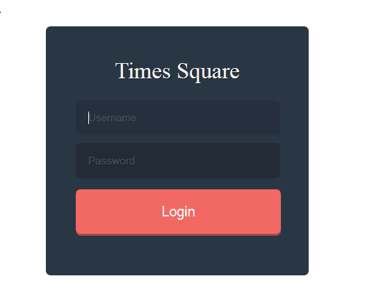
Time Square Login form Design:
This is very simple form design but with great color combinations. Black form with Red Login Button with push 3d effect.
<html>
<head>
    <style type="text/css">
        * {
            margin: 0;
            padding: 0;
            border: none;
            list-style: none;
            -webkit-box-sizing: border-box;
            -moz-box-sizing: border-box;
            box-sizing: border-box;
        }

        body {
            font: 15px/1.25 'Alef';
            color: #111111;
        }

        form {
            margin: 70px auto;
            background: #2a3644;
            width: 347px;
            text-align: center;
            padding: 40px;
            -webkit-border-radius: 6px;
            -moz-border-radius: 6px;
            -ms-border-radius: 6px;
            -o-border-radius: 6px;
            border-radius: 6px;
        }

            form > h1 {
                color: #f4f4f4;
                text-shadow: 1px 1px 0px rgba(0, 0, 0, 0.7);
                font-weight: 400;
                margin-bottom: 20px;
            }

        input {
            background: rgba(0, 0, 0, 0.2);
            color: #fff;
            text-shadow: 1px 1px 0px rgba(0, 0, 0, 0.3);
            display: block;
            width: 269px;
            padding: 15px;
            margin-bottom: 10px;
            -webkit-border-radius: 6px;
            -moz-border-radius: 6px;
            -ms-border-radius: 6px;
            -o-border-radius: 6px;
            border-radius: 6px;
            -webkit-transition: all 0.1s ease-in-out;
            -moz-transition: all 0.1s ease-in-out;
            transition: all 0.1s ease-in-out;
            outline: none;
        }

            input:focus {
                background: rgba(0, 0, 0, 0.1);
                -webkit-transition: all 0.1s ease-in-out;
                -moz-transition: all 0.1s ease-in-out;
                transition: all 0.1s ease-in-out;
            }

        ::-webkit-input-placeholder {
            color: rgba(225, 225, 225, 0.4);
        }

        :-moz-placeholder {
            color: rgba(225, 225, 225, 0.4);
        }

        ::-moz-placeholder {
            color: rgba(225, 225, 225, 0.4);
        }

        :-ms-input-placeholder {
            color: rgba(225, 225, 225, 0.4);
        }

        button {
            position: relative;
            display: block;
            margin-top: 15px;
            margin-bottom: 15px;
            padding: 17px;
            width: 270px;
            -webkit-border-radius: 6px;
            -moz-border-radius: 6px;
            -ms-border-radius: 6px;
            -o-border-radius: 6px;
            border-radius: 6px;
            -webkit-transition: all 0.1s ease-in-out;
            -moz-transition: all 0.1s ease-in-out;
            transition: all 0.1s ease-in-out;
            font-size: 1.2em;
            background: #f26964;
            color: #f4f4f4;
            box-shadow: 0px 3px 0px #ab4b47;
            cursor: pointer;
        }

            button:active {
                top: 3px;
                box-shadow: none;
            }
    </style>
</head>
<body>
    <form>
        <h1>Times Square</h1>
        <input type="text" placeholder="Username" />
        <input type="password" placeholder="Password" />
        <button>Login</button>
    </form>

</body>
</html>
Elegant Login form Design:-
this is really very sober design with Welcome text on header section of form designed with tomato red background color and white grey login form with sky blue login button.
Code In Html and CSS
<html>
<head>
    <style type="text/css">
        * {
            margin: 0;
            padding: 0;
            font: 15px 'Open Sans';
            -webkit-font-smoothing: antialiased;
            font-smoothing: antialiased;
        }

        body {
            background: #e74c3c;
        }

        form {
            position: relative;
            width: 340px;
            height: 250px;
            margin: 50px auto;
            text-align: center;
            background: #ecf0f1;
            padding: 40px;
            -webkit-border-radius: 6px;
            -moz-border-radius: 6px;
            border-radius: 6px;
            -webkit-box-shadow: 0px 1px 0px #ad392d, inset 0px 1px 0px white;
            -moz-box-shadow: 0px 1px 0px #ad392d, inset 0px 1px 0px white;
            box-shadow: 0px 1px 0px #ad392d, inset 0px 1px 0px white;
        }

        h4 {
            font: 2em 'Open Sans';
            font-weight: 300;
            margin-bottom: 25px;
            color: #7f8c8d;
            text-shadow: 1px 1px 0px white;
        }

        input {
            display: block;
            width: 315px;
            padding: 14px;
            -webkit-border-radius: 6px;
            -moz-border-radius: 6px;
            border-radius: 6px;
            border: 0;
            margin-bottom: 10px;
            color: #7f8c8d;
            outline: none;
            font-weight: 600;
        }

            input:focus {
                background: #fafafa;
            }

        ::-webkit-input-placeholder {
            color: #95a5a6;
            font-weight: 300;
        }

        :-moz-placeholder {
            color: #95a5a6;
            font-weight: 300;
        }

        ::-moz-placeholder {
            color: #95a5a6;
            font-weight: 300;
        }

        :-ms-input-placeholder {
            color: #95a5a6;
            font-weight: 300;
        }

        li {
            position: absolute;
            right: 40px;
            bottom: 62px;
            list-style: none;
        }

        a, a:visited {
            text-decoration: none;
            color: #7f8c8d;
            font-weight: 400;
            text-shadow: 1px 1px 0px white;
            -webkit-transition: all .3s ease-in-out;
            -moz-transition: all .3s ease-in-out;
            transition: all .3s ease-in-out;
        }

            a:hover {
                color: #acacac;
                -webkit-transition: all .3s ease-in-out;
                -moz-transition: all .3s ease-in-out;
                transition: all .3s ease-in-out;
            }

        .sub {
            position: relative;
            float: left;
            width: 150px;
            margin-top: 10px;
            background: #3498db;
            color: #fff;
            font-weight: 400;
            text-shadow: 1px 1px 0px #2d7baf;
            box-shadow: 0px 3px 0px #2d7baf;
            -webkit-transition: all .3s ease-in-out;
            -moz-transition: all .3s ease-in-out;
            transition: all .3s ease-in-out;
        }

            .sub:hover {
                background: #38a4ec;
                cursor: pointer;
                -webkit-transition: all .3s ease-in-out;
                -moz-transition: all .3s ease-in-out;
                transition: all .3s ease-in-out;
            }

            .sub:active {
                box-shadow: none;
                top: 4px;
                -webkit-transition: all .3s ease-in-out;
                -moz-transition: all .3s ease-in-out;
                transition: all .3s ease-in-out;
            }
    </style>
</head>
<body>
    <form>
        <h4>Welcome to Jamrock</h4>
        <input class="name" type="text" placeholder="damian@marley.com" />
        <input class="pw" type="password" placeholder="password" />
        <li><a href="#">Forgot your password?</a></li>
        <input class="sub" type="submit" value="Log in" />
    </form>
</body>
</html>
Rounded Corner Login Form Design
This design looks very rich and effective. as per its name there is rounded corner input fields and login button has yellow background. there is only 2 colors Red and yellow this colors are fast although it looks very nice .
Code in HTML and CSS
<html>
<head>
    <style type="text/css">
        @import url(http://fonts.googleapis.com/css?family=Allerta);

        * {
            margin: 0px;
            padding: 0px;
        }

        body {
            background: #fff;
            position: relative;
            padding: 20px;
            font-family: Allerta;
        }

        #loginform {
            width: 250px;
            height: auto;
            position: relative;
            margin: 0 auto;
            padding: 30px 35px;
            background: #bc2e1c; /* Old browsers */
            background: -moz-linear-gradient(left, #bc2e1c 0%, #d0422e 20%, #d0422e 80%, #bc2e1c 100%); /* FF3.6+ */
            background: -webkit-gradient(linear, left top, right top, color-stop(0%,#bc2e1c), color-stop(20%,#d0422e), color-stop(80%,#d0422e), color-stop(100%,#bc2e1c)); /* Chrome,Safari4+ */
            background: -webkit-linear-gradient(left, #bc2e1c 0%,#d0422e 20%,#d0422e 80%,#bc2e1c 100%); /* Chrome10+,Safari5.1+ */
            background: -o-linear-gradient(left, #bc2e1c 0%,#d0422e 20%,#d0422e 80%,#bc2e1c 100%); /* Opera 11.10+ */
            background: -ms-linear-gradient(left, #bc2e1c 0%,#d0422e 20%,#d0422e 80%,#bc2e1c 100%); /* IE10+ */
            background: linear-gradient(to right, #bc2e1c 0%,#d0422e 20%,#d0422e 80%,#bc2e1c 100%); /* W3C */
            filter: progid:DXImageTransform.Microsoft.gradient( startColorstr='#bc2e1c', endColorstr='#bc2e1c',GradientType=1 ); /* IE6-9 */
            border-radius: 5px;
        }

        input {
            display: block;
            margin: 15px auto;
            border-radius: 30px;
            background: #c33624; /* Old browsers */
            background: -moz-linear-gradient(top, #c33624 0%, #db4836 100%); /* FF3.6+ */
            background: -webkit-gradient(linear, left top, left bottom, color-stop(0%,#c33624), color-stop(100%,#db4836)); /* Chrome,Safari4+ */
            background: -webkit-linear-gradient(top, #c33624 0%,#db4836 100%); /* Chrome10+,Safari5.1+ */
            background: -o-linear-gradient(top, #c33624 0%,#db4836 100%); /* Opera 11.10+ */
            background: -ms-linear-gradient(top, #c33624 0%,#db4836 100%); /* IE10+ */
            background: linear-gradient(to bottom, #c33624 0%,#db4836 100%); /* W3C */
            filter: progid:DXImageTransform.Microsoft.gradient( startColorstr='#c33624', endColorstr='#db4836',GradientType=0 ); /* IE6-9 */
            width: 215px;
            padding: 12px;
            border: none;
            color: #e8bdb9;
            box-shadow: inset 0px 10px 20px #c13524;
            font-size: 0.8em;
        }

            input[type=submit] {
                width: 230px;
                background: #ffc000; /* Old browsers */
                background: -moz-linear-gradient(top, #ffc000 0%, #ffa000 100%); /* FF3.6+ */
                background: -webkit-gradient(linear, left top, left bottom, color-stop(0%,#ffc000), color-stop(100%,#ffa000)); /* Chrome,Safari4+ */
                background: -webkit-linear-gradient(top, #ffc000 0%,#ffa000 100%); /* Chrome10+,Safari5.1+ */
                background: -o-linear-gradient(top, #ffc000 0%,#ffa000 100%); /* Opera 11.10+ */
                background: -ms-linear-gradient(top, #ffc000 0%,#ffa000 100%); /* IE10+ */
                background: linear-gradient(to bottom, #ffc000 0%,#ffa000 100%); /* W3C */
                filter: progid:DXImageTransform.Microsoft.gradient( startColorstr='#ffc000', endColorstr='#ffa000',GradientType=0 ); /* IE6-9 */
                box-shadow: 0px 3px 2px #c13524;
                font-size: 0.9em;
                color: #b15a03;
                font-weight: bold;
                cursor: pointer;
                margin: 30px auto 10px;
                -webkit-transition: 0.5s ease;
                -moz-transition: 0.5s ease;
                -o-transition: 0.5s ease;
                -ms-transition: 0.5s ease;
                transition: 0.5s ease;
            }

                input[type=submit]:hover {
                    box-shadow: 0px 5px 2px #c13524;
                    -webkit-transition: 0.5s ease;
                    -moz-transition: 0.5s ease;
                    -o-transition: 0.5s ease;
                    -ms-transition: 0.5s ease;
                    transition: 0.5s ease;
                    color: #fff;
                    text-shadow: 0px 1px 1px #a05001;
                }

            input:focus {
                outline: none;
            }

        ::-webkit-input-placeholder {
            color: #e8bdb9;
        }

        :-moz-placeholder { /* Firefox 18- */
            color: #e8bdb9;
        }

        ::-moz-placeholder { /* Firefox 19+ */
            color: #e8bdb9;
        }

        :-ms-input-placeholder {
            color: #e8bdb9;
        }

        h1 {
            text-align: center;
            color: #fff;
            font-size: 2.5em;
            padding: 10px 0px;
            text-shadow: 0px -3px 2px #b52311;
        }

        #note {
            color: #e8bdb9;
            font-size: 0.7em;
            text-align: center;
        }

        #icons {
            text-align: center;
            padding: 0px 0px 10px 0px;
        }

        .fa-star {
            color: #fff;
            font-size: 4em;
            text-shadow: 0px 5px 2px #b52311;
        }

        a {
            color: #e8bdb9;
            text-decoration: none;
            font-weight: bold;
        }
    </style>
</head>
<body>

    <div id="loginform">
        <div id="icons"><i class="fa fa-star"></i></div>
        <h1>Login</h1>
        <input type="text" placeholder="Your E-mail" value="" />
        <input type="password" placeholder="Your Password" value="" />
        <input type="submit" value="Sign Up" />
        <div id="note">All ready throwing balls? <a href="#">Log In</a></div>
    </div>
</body>
</html>
Simple Blue Login Design
Code In HTML and CSS
<html>
<head>
    <style type="text/css">
    * {
  margin: 0;
  padding: 0;
  border: none;
  list-style: none;
  -webkit-box-sizing: border-box;
  -moz-box-sizing: border-box;
  box-sizing: border-box;
}
body {
  font: 15px/1.25 'Open Sans' sans-serif;
  background: #2a3644;
  padding: 50px;
}
form {
  width: 50%;
  background: #eeeeee;
  -webkit-border-radius: 6px;
  -moz-border-radius: 6px;
  -ms-border-radius: 6px;
  -o-border-radius: 6px;
  border-radius: 6px;
  padding: 40px;
  margin: 0 auto;
}
form > input {
  display: block;
  padding: 20px;
  width: 100%;
  outline: none;
  border: 1px solid #bbbbbb;
  font-size: 80%;
  font-family: 'Open Sans';
}
form > .top {
  border-radius: 10px 10px 0px 0px;
  border-bottom: 0px;
}
form > .bottom {
  border-radius: 0px 0px 10px 10px;
}
button {
  width: 100%;
  margin-top: 10px;
  padding: 20px;
  -webkit-border-radius: 6px;
  -moz-border-radius: 6px;
  -ms-border-radius: 6px;
  -o-border-radius: 6px;
  border-radius: 6px;
  font-size: 120%;
  background: #2296cf;
  color: #ffffff;
  cursor: pointer;
  -webkit-transition: all 0.3s ease-in-out;
  -moz-transition: all 0.3s ease-in-out;
  transition: all 0.3s ease-in-out;
}
button:hover {
  -webkit-transition: all 0.3s ease-in-out;
  -moz-transition: all 0.3s ease-in-out;
  transition: all 0.3s ease-in-out;
  opacity: 0.9;
}
h1 {
  text-align: center;
  padding: 0px 20px 30px 20px;
  color: #bbbbbb;
  text-shadow: 1px 1px 0px #ffffff;
  font-weight: 300;
  font-size: 1.5em;
}
</style>
    <script type="text/javascript">

    </script>
</head>
<body>
    <form>
        <h1>Hello World</h1>
        <input class="top" type="name" placeholder="Username" />
        <input class="bottom" type="password" placeholder="Password" />
        <button>Login</button>
    </form>
</body>
</html>
Simple Dark Design
this design is responsive and simple build with just 2 colors red and black. bellow the login button htere is two links "forgot password" and "create an account".
Code In HTML and CSS
<html>
<head>
<title></title>
<style type="text/css">
a {
text-decoration: none;
}
body {
font-family: "Helvetica Neue", Helvetica, Arial, sans-serif;
font-size: 14px;
line-height: 20px;
color: #333;
}
.login-screen {
min-height: 317px;
padding: 38px 681px 74px 326px;
}
.login {
color: #FFF;
position: relative;
}
.login-screen {
min-height: 317px;
padding: 38px 681px 74px 326px;
}
.login-form {
background-color: #121317;
padding: 24px 23px 20px;
position: relative;
}
.login-form:before {
content: "";
border-style: solid;
border-width: 12px 12px 12px 0;
border-color: #E04A32;
background: #E04A32;
height: 25px;
position: absolute;
left: 0px;
top: 22px;
width: 4px;
-webkit-transform: rotate(360deg);
}
.login-form .control-group {
margin-bottom: 6px;
position: relative;
}
.login-form .login-field {
border-color: rgba(0, 0, 0, 0);
font-size: 17px;
padding-bottom: 11px;
padding-top: 11px;
text-indent: 3px;
width: 284px;
}
textarea, input[type="text"], input[type="password"], input[type="datetime"], input[type="datetime-local"], input[type="date"], input[type="month"], input[type="time"], input[type="week"], input[type="number"], input[type="email"], input[type="url"], input[type="search"], input[type="tel"], input[type="color"], .uneditable-input {
border: 2px solid #DCE4EC;
color: #34495E;
font-family: "Lato", sans-serif;
font-size: 14px;
padding: 8px 0 9px 10px;
text-indent: 1px;
-webkit-box-shadow: none;
-moz-box-shadow: none;
box-shadow: none;
}
textarea, input[type="text"], input[type="password"], input[type="datetime"], input[type="datetime-local"], input[type="date"], input[type="month"], input[type="time"], input[type="week"], input[type="number"], input[type="email"], input[type="url"], input[type="search"], input[type="tel"], input[type="color"], .uneditable-input {
background-color: #202125;
border: 1px solid #CCC;
-webkit-box-shadow: inset 0 1px 1px rgba(0, 0, 0, 0.075);
-moz-box-shadow: inset 0 1px 1px rgba(0, 0, 0, 0.075);
box-shadow: inset 0 1px 1px rgba(0, 0, 0, 0.075);
-webkit-transition: border linear 0.2s, box-shadow linear 0.2s;
-moz-transition: border linear 0.2s, box-shadow linear 0.2s;
-o-transition: border linear 0.2s, box-shadow linear 0.2s;
transition: border linear 0.2s, box-shadow linear 0.2s;
}
select, textarea, input[type="text"], input[type="password"], input[type="datetime"], input[type="datetime-local"], input[type="date"], input[type="month"], input[type="time"], input[type="week"], input[type="number"], input[type="email"], input[type="url"], input[type="search"], input[type="tel"], input[type="color"], .uneditable-input {
display: inline-block;
height: 20px;
padding: 4px 6px;
margin-bottom: 10px;
font-size: 14px;
line-height: 20px;
color: #B4B4B4;
vertical-align: middle;
}
input, textarea, .uneditable-input {
width: 192px;
}
input, textarea, .uneditable-input {
margin-left: 0;
}
input, textarea, .uneditable-input {
width: 206px;
}
input, button, select, textarea {
font-family: "Helvetica Neue", Helvetica, Arial, sans-serif;
}
label, input, button, select, textarea {
font-size: 14px;
font-weight: normal;
line-height: 20px;
}
button, input {
line-height: normal;
}
button, input, select, textarea {
margin: 0;
font-size: 100%;
vertical-align: middle;
}
label {
display: block;
margin-bottom: 5px;
}
.btn.btn-primary {
background-color: #E04A32;
}
.btn.btn-large {
padding-bottom: 12px;
padding-top: 13px;
}
.btn {
border: none;
background: #34495E;
color: #FFF;
font-size: 16.5px;
text-decoration: none;
text-shadow: none;
-webkit-box-shadow: none;
-moz-box-shadow: none;
box-shadow: none;
-webkit-transition: 0.25s;
-moz-transition: 0.25s;
-o-transition: 0.25s;
transition: 0.25s;
-webkit-backface-visibility: hidden;
text-align: center;
border-top: 2px solid #FD7964;
}
.btn a:hover {
color: #fff;
text-decoration: none;
}
.btn-block {
display: block;
width: 100%;
padding-right: 0;
padding-left: 0;
-webkit-box-sizing: border-box;
-moz-box-sizing: border-box;
box-sizing: border-box;
}
.btn-large {
padding: 11px 19px;
font-size: 17.5px;
}
.btn.btn-primary:hover, .btn.btn-primary:focus {
background-color: #E75849;
border-top: 2px solid #FD7964;
}
p {
margin: 0 0 10px;
}
.login-link {
color: #BFC9CA;
font-size: 13px;
margin-right: 11px;
text-align: center;
text-shadow: 0 1px 1px rgba(0, 0, 0, 0.2);
}
.login-link a:hover {
color: #e04a32;
text-decoration: none;
}
.user {
background: rgba(0, 0, 0, 0) url(user.png) no-repeat 0px 0px;
width: 29px;
height: 28px;
position: absolute;
top: 50px;
left: 263px;
}
.key {
background: rgba(0, 0, 0, 0) url(key.png) no-repeat 0px 0px;
width: 29px;
height: 28px;
position: absolute;
top: 11px;
left: 265px;
}
.user-white {
background: rgba(0, 0, 0, 0) url(http://s24.postimg.org/hw812itpt/user.png) no-repeat 0px 0px;
width: 29px;
height: 28px;
position: absolute;
top: 50px;
left: 263px;
}
.key-white {
background: rgba(0, 0, 0, 0) url(http://s21.postimg.org/5hz17f6c3/key.png) no-repeat 0px 0px;
width: 29px;
height: 28px;
position: absolute;
top: 11px;
left: 265px;
}
.create {
color: #e04a32;
}
.white-login {
float: right;
position: absolute;
top: 38px;
right: 281px;
}
@media screen and (max-width: 480px) {
.login-screen {
min-height: 317px;
padding: 38px 681px 74px 326px;
width: 42%;
}
.login-form {
background-color: #121317;
padding: 24px 23px 20px;
position: relative;
width: 299px;
}
.btn-large {
padding: 11px 149;
font-size: 17.5px;
}
}
/* =Media Queries
-------------------------------------------------------------- */
@media only screen and (max-width: 1150px) {
.login-screen {
min-height: 317px;
padding: 38px 681px 74px 326px;
width: 42%;
}
.login-form {
background-color: #121317;
padding: 24px 23px 20px;
position: relative;
width: 299px;
}
.btn-large {
padding: 11px 149;
font-size: 17.5px;
}
}
@media only screen and (max-width: 1024px) {
.login-screen {
min-height: 317px;
padding: 38px 681px 74px 326px;
width: 42%;
}
.login-form {
background-color: #121317;
padding: 24px 23px 20px;
position: relative;
width: 299px;
}
.btn-large {
padding: 11px 149;
font-size: 17.5px;
}
}
@media only screen and (max-width: 960px) {
.login-screen {
min-height: 317px;
padding: 38px 681px 74px 326px;
width: 42%;
}
.login-form {
background-color: #121317;
padding: 24px 23px 20px;
position: relative;
width: 299px;
}
.btn-large {
padding: 11px 149;
font-size: 17.5px;
}
}
@media only screen and (max-width: 920px) {
.login-screen {
min-height: 317px;
padding: 38px 681px 74px 326px;
width: 42%;
}
.login-form {
background-color: #121317;
padding: 24px 23px 20px;
position: relative;
width: 299px;
}
.btn-large {
padding: 11px 149;
font-size: 17.5px;
}
}
@media only screen and (max-width: 880px) {
.login-screen {
min-height: 317px;
padding: 38px 681px 74px 326px;
width: 42%;
}
.login-form {
background-color: #121317;
padding: 24px 23px 20px;
position: relative;
width: 299px;
}
.btn-large {
padding: 11px 149;
font-size: 17.5px;
}
}
@media only screen and (max-width: 850px) {
.login-screen {
min-height: 317px;
padding: 38px 681px 74px 326px;
width: 42%;
}
.login-form {
background-color: #121317;
padding: 24px 23px 20px;
position: relative;
width: 299px;
}
.btn-large {
padding: 11px 149;
font-size: 17.5px;
}
}
@media only screen and (max-width: 770px) {
.login-screen {
min-height: 317px;
padding: 38px 681px 74px 326px;
width: 42%;
}
.login-form {
background-color: #121317;
padding: 24px 23px 20px;
position: relative;
width: 299px;
}
.btn-large {
padding: 11px 149;
font-size: 17.5px;
}
}
@media only screen and (max-width: 750px) {
.login-screen {
min-height: 317px;
padding: 38px 681px 74px 326px;
width: 42%;
}
.login-form {
background-color: #121317;
padding: 24px 23px 20px;
position: relative;
width: 299px;
}
.btn-large {
padding: 11px 149;
font-size: 17.5px;
}
}
@media only screen and (max-width: 680px) {
.login-screen {
min-height: 317px;
padding: 38px 681px 74px 326px;
width: 42%;
}
.login-form {
background-color: #121317;
padding: 24px 23px 20px;
position: relative;
width: 299px;
}
.btn-large {
padding: 11px 149;
font-size: 17.5px;
}
}
@media only screen and (max-width: 620px) {
.login-screen {
min-height: 317px;
padding: 38px 681px 74px 326px;
width: 42%;
}
.login-form {
background-color: #121317;
padding: 24px 23px 20px;
position: relative;
width: 299px;
}
.btn-large {
padding: 11px 149;
font-size: 17.5px;
}
}
@media only screen and (max-width: 585px) {
.login-screen {
min-height: 317px;
padding: 38px 681px 74px 326px;
width: 42%;
}
.login-form {
background-color: #121317;
padding: 24px 23px 20px;
position: relative;
width: 299px;
}
.btn-large {
padding: 11px 149;
font-size: 17.5px;
}
}
@media only screen and (max-width: 540px) {
.login-screen {
min-height: 317px;
padding: 38px 681px 74px 326px;
width: 42%;
}
.login-form {
background-color: #121317;
padding: 24px 23px 20px;
position: relative;
width: 299px;
}
.btn-large {
padding: 11px 149;
font-size: 17.5px;
}
}
@media only screen and (max-width: 520px) {
.login-screen {
min-height: 317px;
padding: 38px 681px 74px 326px;
width: 42%;
}
.login-form {
background-color: #121317;
padding: 24px 23px 20px;
position: relative;
width: 299px;
}
.btn-large {
padding: 11px 149;
font-size: 17.5px;
}
}
@media only screen and (max-width: 480px) {
.login-screen {
min-height: 317px;
padding: 38px 681px 74px 326px;
width: 42%;
}
.login-form {
background-color: #121317;
padding: 24px 23px 20px;
position: relative;
width: 299px;
}
.btn-large {
padding: 11px 149;
font-size: 17.5px;
}
}
@media only screen and (max-width: 450px) {
.login-screen {
min-height: 317px;
padding: 38px 681px 74px 326px;
width: 42%;
}
.login-form {
background-color: #121317;
padding: 24px 23px 20px;
position: relative;
width: 299px;
}
.btn-large {
padding: 11px 149;
font-size: 17.5px;
}
}
@media only screen and (max-width: 420px) {
.login-screen {
min-height: 317px;
padding: 38px 681px 74px 326px;
width: 42%;
}
.login-form {
background-color: #121317;
padding: 24px 23px 20px;
position: relative;
width: 299px;
}
.btn-large {
padding: 11px 149;
font-size: 17.5px;
}
}
@media only screen and (max-width: 380px) {
.login-screen {
min-height: 317px;
padding: 38px 681px 74px 326px;
width: 42%;
}
.login-form {
background-color: #121317;
padding: 24px 23px 20px;
position: relative;
width: 299px;
}
.btn-large {
padding: 11px 149;
font-size: 17.5px;
}
}
@media only screen and (max-width: 360px) {
.login-screen {
min-height: 317px;
padding: 38px 681px 74px 326px;
width: 42%;
}
.login-form {
background-color: #121317;
padding: 24px 23px 20px;
position: relative;
width: 299px;
}
.btn-large {
padding: 11px 149;
font-size: 17.5px;
}
}
@media only screen and (max-width: 350px) {
.login-screen {
min-height: 317px;
padding: 38px 681px 74px 326px;
width: 42%;
}
.login-form {
background-color: #121317;
padding: 24px 23px 20px;
position: relative;
width: 299px;
}
.btn-large {
padding: 11px 149;
font-size: 17.5px;
}
}
@media only screen and (max-width: 786px) {
.login-screen {
min-height: 317px;
padding: 38px 681px 74px 326px;
width: 42%;
}
.login-form {
background-color: #121317;
padding: 24px 23px 20px;
position: relative;
width: 299px;
}
.btn-large {
padding: 11px 149;
font-size: 17.5px;
}
}
@media only screen and (max-width: 325px) {
.login-screen {
min-height: 317px;
padding: 38px 681px 74px 326px;
width: 42%;
}
.login-form {
background-color: #121317;
padding: 24px 23px 20px;
position: relative;
width: 299px;
}
.btn-large {
padding: 11px 149;
font-size: 17.5px;
}
}
</style>
<script type="text/javascript">
</script>
</head>
<body>
<div class="login">
<div class="login-screen">
<div class="login-form">
<div class="control-group">
<div style="margin-left: 22px; margin-bottom: 22px; margin-top: -9px;">
<h1>SIGN IN</h1>
</div>
<input type="text" class="login-field" value="" placeholder="Username" id="login-name">
<label class="user" for="login-name"></label>
</div>
<div class="control-group">
<input type="password" class="login-field" value="" placeholder="Password" id="login-pass">
<label class="key" for="login-pass"></label>
</div>
<a class="btn btn-primary btn-large btn-block" href="#">Login</a>
<p style="margin-top: 12px;">
<a class="login-link" href="#">Forgot password? </a>
<a class="login-link create" href="#">Create an account</a>
</p>
</div>
</div>
</div>
</body>
</html>
Quick Login Box
this design is very simple and small. there is no more heavy controls or designs there is just two input text fields and one right side button. this form has one extra feature which is javascript validation with tool tip message indicators this makes it professional. here is the looks of design
Code in HTML and CSS
<html>
<head>
    <style type="text/css">
        * {
            margin: 0px;
            padding: 0px;
            outline: none;
        }


        body {
            position: relative;
            padding: 20px;
            font-family: verdana;
            background: #34495E;
        }

        #loginform {
            width: 320px;
            overflow: auto;
            border-radius: 10px 0px 0px 10px;
            margin: 0 auto;
            position: relative;
        }

        #inputs {
            float: left;
            padding: 11px 20px;
            height: 111px;
            width: 230px;
            background: #fff;
        }

        input {
            display: block;
            border: none;
            width: 95%;
            padding: 20px 10px;
            font-size: 15px;
        }

        #inputs input:first-child {
            border-bottom: 1px solid #9f9f9f;
        }

        button {
            display: block;
            float: left;
            background: #00BFF3;
            border: none;
            height: 133px;
            padding: 0px 15px;
            border-radius: 0px 10px 10px 0px;
            cursor: pointer;
            -webkit-transition: 0.5s ease;
            -moz-transition: 0.5s ease;
            -o-transition: 0.5s ease;
            -ms-transition: 0.5s ease;
            transition: 0.5s ease;
        }

            button:hover {
                background: #4ad4f6;
                -webkit-transition: 0.5s ease;
                -moz-transition: 0.5s ease;
                -o-transition: 0.5s ease;
                -ms-transition: 0.5s ease;
                transition: 0.5s ease;
            }

            button i {
                font-size: 16px!important;
                color: #fff!important;
            }

        ::-webkit-input-placeholder {
            color: #9f9f9f;
        }

        :-moz-placeholder { /* Firefox 18- */
            color: #9f9f9f;
        }

        ::-moz-placeholder { /* Firefox 19+ */
            color: #9f9f9f;
        }

        :-ms-input-placeholder {
            color: #9f9f9f;
    </style>
</head>
<body>
    <div id="loginform">
        <form action="">
            <div id="inputs">
                <input type="text" value="" placeholder="Username" required>
                <input type="text" value="" placeholder="Password" required>
            </div>
            <button type="submit"><i class="fa fa-arrow-right"></i></button>
        </form>
    </div>
</body>
</html>
Dark Lemon Login Form Design
This design is really very cool it has awesome animation effect and responsive design. This design is very rich and powerfull but it still looks very profassional it is perfectly designed with creative color combanations.
Code in HTML and CSS
       <html>
<head></head>
<style type="text/css">
    body {
        background: #2f313d;
        color: #46485c;
        font-family: sans-serif;
    }

    h2 {
        color: #46485c;
        font-size: 15px;
        font-weight: 600;
        text-align: center;
        margin-bottom: 10px;
    }

    a {
        color: #46485c;
        text-decoration: none;
    }

    .login {
        width: 250px;
        position: absolute;
        top: 50%;
        left: 50%;
        margin: -184px 0px 0px -155px;
        background: rgba(0,0,0,0.2);
        padding: 20px 30px;
        border-radius: 5px;
        box-shadow: 0px 1px 0px rgba(0,0,0,0.3),inset 0px 1px 0px rgba(255,255,255,0.07);
    }

    input[type="text"], input[type="password"] {
        width: 250px;
        padding: 25px 0px;
        background: transparent;
        border: 0;
        border-bottom: 1px solid rgba(255,255,255,0.04);
        outline: none;
        color: #46485c;
        font-size: 12px;
    }

    input[type=checkbox] {
        display: none;
    }

    label {
        display: block;
        position: absolute;
        margin-right: 10px;
        width: 8px;
        height: 8px;
        border-radius: 50%;
        background: transparent;
        content: "";
        transition: all 0.3s ease-in-out;
        cursor: pointer;
        border: 3px solid #46485c;
    }

    #remember:checked ~ label[for=remember] {
        background: #b5cd60;
    }

    input[type="submit"] {
        background: #b5cd60;
        border: 0;
        width: 250px;
        height: 40px;
        border-radius: 3px;
        color: white;
        cursor: pointer;
        transition: background 0.3s ease-in-out;
    }

        input[type="submit"]:hover {
            background: #16aa56;
        }

    .forgot {
        margin-top: 30px;
        display: block;
        font-size: 11px;
        text-align: center;
        font-weight: bold;
    }

        .forgot:hover {
            margin-top: 30px;
            display: block;
            font-size: 11px;
            text-align: center;
            font-weight: bold;
            color: #6d7781;
        }

    .remember {
        padding: 30px 0px;
        font-size: 12px;
        text-indent: 25px;
        line-height: 15px;
    }

    ::-webkit-input-placeholder {
        color: #46485c;
    }

    [placeholder]:focus::-webkit-input-placeholder {
        transition: all 0.2s linear;
        transform: translate(10px, 0);
        opacity: 0;
    }
</style>
<script type="text/javascript">
    //show password
    $(document).ready(function () {
        $("#pw").focus(function () {
            this.type = "text";
        }).blur(function () {
            this.type = "password";
        })
    });

    //Placeholder fixed for Internet Explorer
    $(function () {
        var input = document.createElement("input");
        if (('placeholder' in input) == false) {
            $('[placeholder]').focus(function () {
                var i = $(this);
                if (i.val() == i.attr('placeholder')) {
                    i.val('').removeClass('placeholder');
                    if (i.hasClass('password')) {
                        i.removeClass('password');
                        this.type = 'password';
                    }
                }
            }).blur(function () {
                var i = $(this);
                if (i.val() == '' || i.val() == i.attr('placeholder')) {
                    if (this.type == 'password') {
                        i.addClass('password');
                        this.type = 'text';
                    }
                    i.addClass('placeholder').val(i.attr('placeholder'));
                }
            }).blur().parents('form').submit(function () {
                $(this).find('[placeholder]').each(function () {
                    var i = $(this);
                    if (i.val() == i.attr('placeholder'))
                        i.val('');
                })
            });
        }
    });
</script>
<body>

    <div class='login'>
        <h2>Sign in</h2>
        <input name='username' placeholder='Username' type='text' />
        <input id='pw' name='password' placeholder='Password' type='password' />
        <div class='remember'>
            <input checked='' id='remember' name='remember' type='checkbox' />
            <label for='remember'></label>
            Remember me
        </div>
        <input type='submit' value='Sign in' />
        <a class='forgot' href='#'>Forgot your password?</a>
    </div>

    <script class="cssdeck" src="//cdnjs.cloudflare.com/ajax/libs/jquery/1.8.0/jquery.min.js"></script>

</body>
</html>


.jpg)


